February 29, 2012


via


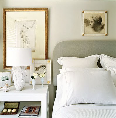
I have always been drawn to the look of small object's above bed's.  As you know I like to play with scale in design and going big is not always the answer.  Using a small object on a large wall can make a big impact. Using a small object above a bed creates a light feeling and also brings the eye up instead of a heavy piece of art possibly weighing the room down.  I like the simplicity of this idea. 


via


via


Lonny


Lonny


Lauren Leiss Design


This last picture is an older picture of our bedroom.  Sorry it is so grainy but I wanted to point out the small little brass plate above our bed.  Not the same effect of the professional design photo's but I do like it.
What do you think about this look?  Do you like the idea of using small scale to create an impact?

Be Well,
Heather

February 27, 2012

Dad & The Giraffe


Sorry for the lack of posts.  My dad came up for a visit and we were busy having way too much fun!  Whenever he comes up to Oregon, we try to hit restaurants showcased on Dinner's Drive in's and Dives.  Have you seen that show?! I think I gained 5 pounds in 3 days.  So worth it though. 
To say the least, my Dad is super excited about becoming a grandpa and brought up a little or should I say  huge present for Collin. 


I had Nixon sit in front of the giraffe to show the scale.  I love it!  It will be such a fun addition to his nursery.  I told my dad I will be calling him when Collin is 2 and wants to bring his giraffe to the grocery store!  I'm sure these things will happen. 
I found some pictures of nurseries that also used a giraff in the decor. 


*All images via Pinterest. Keyword: Giaraff
Oh the possibilities in a nursery.  I have found that some of my childhood fantasies have come out while planning for Collin's nursery.  So fun!

Be Well,
Heather

February 23, 2012

Peter Dunham. A Girl Can Dream.


If I lived in a fabric store and the store was on fire and I could only take one fabric it would be Fig Leaf by Peter Dunham.  I have coveted this fabric for years. That's right, years!  I love the scale.  I love the colors.  I love the simplicity yet boldness of the fabric.  I could go on and on but here are some rooms where you can spot a bit or a lot of the print.


 When House Beautiful did  THIS spread with Peter Dunham and used Fig Leaf in the room I was thrilled. I then saw they used the fabric on a decorator's table.


Isn't the room amazing by the way?! All the layers and texture. Anyway, it made me think of our decorator's table in our living room.


If I had 150 bucks to spend per yard on fabric, I would definitely change our jute table cloth for one like this....


A GIRL CAN DREAM.

Be Well,
Heather

February 22, 2012


One of my favorite sources for lighting, School House Electric has come out with their own line of hardware.  If you have a small obsession with hardware like I, you better take a look!  Even if you aren't in the market for new hardware I would make a mental note.  You never know when you are going to need some jewelry for your furniture.

Be Well,
Heather

February 21, 2012

My Blue Star Fern


Hope you all had a wonderful weekend!  I worked my tush off this past week between my job, painting furniture and Stella & Dot parties!  It is so worth it when Matt & I see it "paying off"...literally!  We have almost saved what we need for the adoption! All  said and done the adoption will cost upwards of 30,000 dollars. To be able to say with lots of praying, working and eating top roman, we are almost there!
That being said, I have been very good about saving and not spending.  However, this past weekend I was grocery shopping and saw this beautiful blue star fern.  I am a sucker for house plants and had an empty plant stand calling it's name.  I splurged and took it home with me where it now lives in our entry making me smile every time I come and go.  It is truly the little things that sometimes make your soul smile. 

Be Well,
Heather

February 20, 2012

Being Patriotic

Here's a little Red, White and blue....


via


Hope you all are enjoying the extra day of play!  Think of me while I'm working and not playing at all.

Be Well,
Heather

February 17, 2012

Tie Dye Drape DIY

via


I wasn't planning on posting this weekend but when I ran across this picture, I had to share it with you guys.  Take a look at those fun tie dye drapes.  Those are Ikea's 100% cotton drapes. To check out  the steps involved go here.  Easy peasy!  Wouldn't they look great in nursery or even a beach house? 

Have a wonderful weekend!

Be Well,
Heather

Then and Now


Then


NOW


I know the first picture is hard on the eyes, but you have to give me credit for trying!  The ONLY thing I miss about the first picture is my fiddle leaf fig tree.  Sadly, they're really hard to keep alive! Do you like my tacky poster I purchased at Bed Bath and Beyond? Don't answer that! I also had a hard time displaying  accessories. I have learned that if you love it, display it!  Not that the "NOW" picture is perfect in design by any means.  It is far from House Beautiful worthy.  It might need some tweeking, but I smile when I walk in the room.  
I have learned at least one important lesson over the years...


Be Well,
Heather

February 15, 2012

Nate Show: Hammered Metal


I was watching the Nate Berkus show the other day and saw this pretty little lady.  Nate was talking about using hammered metals in design to add texture.  He touched on this Sahara Hammered Metal Pendant from one of my favorite light sources, Shades of Light.  I have been eyeing Thomas O'Brien's Goodman metal pendant for our kitchen but for 800+ bucks he's got another thing commin'! The video below is a snippet from the Nate Show where he talks about the Sahara Pendant.  For 300 and change, I think it would be a nice compromise. What do you think?


Do you have any hammered metal in your home?

Be Well,
Heather

February 13, 2012

Cooking Up Plans


I can't even tell you how excited I am!! We are taking the plunge and putting in new counter tops and back splash! With the state of the economy and the housing market, our starter home has quickly become our second home. Since we will be here for awhile, we decided to add some special yet functional touches to our my kitchen.
The above is the scheme we chose. Our cabinets are natural maple that is just too nice to paint so we are keeping them as is.
For the counters we are going with a white Silestone. There are SO many choices out there when it comes to counters! We found that Silestone was the best match for our family. I will go into detail about the pros and cons later. I am most excited about the carrara marble subway tiles for back splash!! Oh the excitement.
Tomorrow I will post a before picture of our kitchen before demolition starts. I can't wait to share with you this process.

Do you like what we chose?  Do any of you have Silestone?  Do you like it?

I will leave you with some gorgeous kitchens that definitely made my decision a bit easier...


 * All images found here.

Be Well,
Heather

February 10, 2012

Photo Ledge Envy


I just love a good photo ledge.  It is perfect when looking for a way to fill an empty wall that needs some character.  These images were my inspiration when adding a gallery wall to our landing.  I'll make sure to share the process and pictures with you this week!


* All images can be viewed here.

 Be Well,
Heather